
Velta
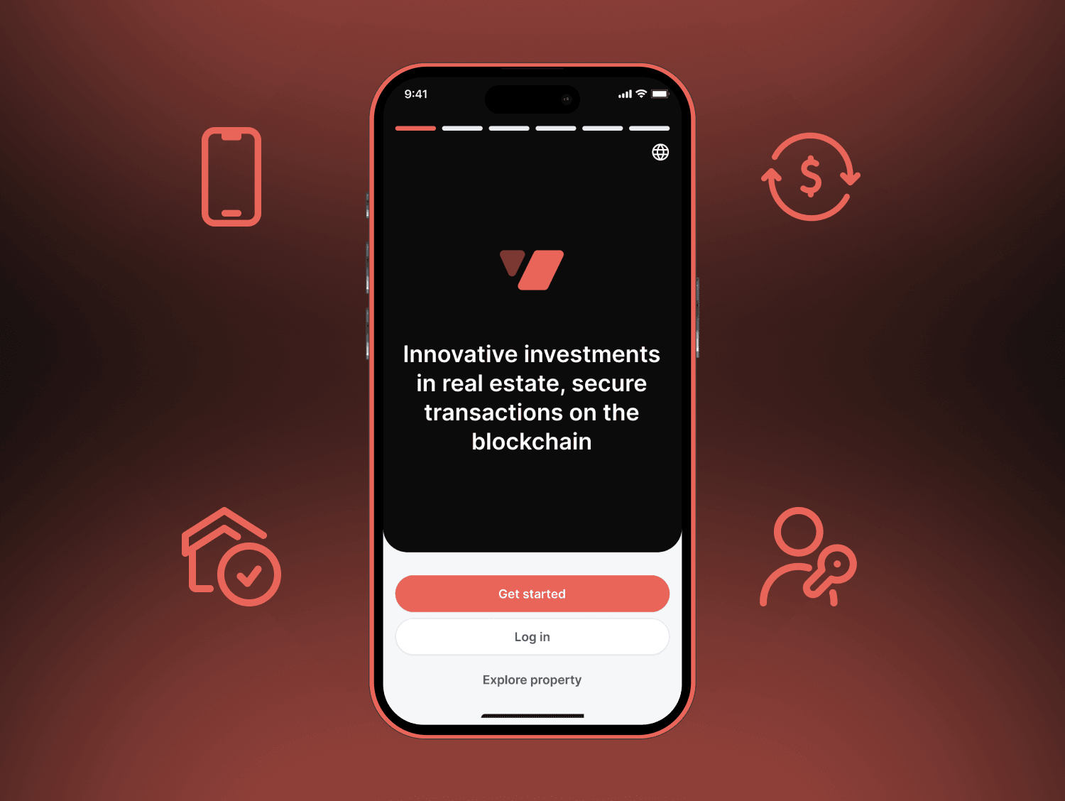
Putting real estate ownership on the blockchain without the crypto learning curve.
Velta is a Web3 real estate marketplace that connects property developers with investors. Properties are tokenized so people can own a fraction of a building with crypto. My job was to make that feel as simple as browsing a property listing.
Problem
Real estate was meeting blockchain, but the UX was not keeping up.
- Web3 complexity: wallets, transactions, and token mechanics overwhelmed people who were new to crypto.
- No unified platform: investors and developers had no single place to discover, tokenize, and trade fractional property.
- Intimidating crypto UX: existing investment flows felt technical and risky.
- No tokenization tools: developers had no simple way to split and list their assets on chain.
The investor persona summed it up: they wanted to put small amounts into real estate, but did not understand wallets, gas fees, or token swaps.
My role
I worked as UX researcher and UI designer across the full project, over 2 months in 2022. That covered research, information architecture, flows, wireframes, the visual design system, hi fi screens, prototypes, testing, and handoff.
Research
I spent 20+ hours on research: a Web3 and crypto market analysis, a review of existing tokenized property products, a behavior study for both the investor and developer personas, and feature prioritization across the two portals.
Approach
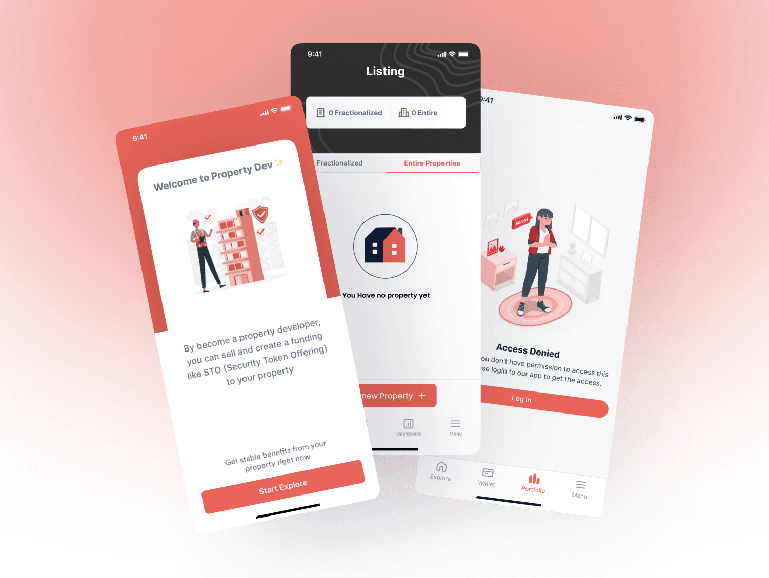
The core decision was to build two portals, one for investors and one for developers, on one shared design language. Each portal is tuned to its user's tasks, but they share components, so it still reads as one product.
- Investor journey: onboarding, KYC, browse, view details, invest, track portfolio.
- Developer journey: register, add property, set tokenization, publish, track investments.
The rule I kept coming back to was to hide the blockchain, not the value. People do not need to understand smart contracts to invest. They need to see what they are buying and what it might earn.
Try it
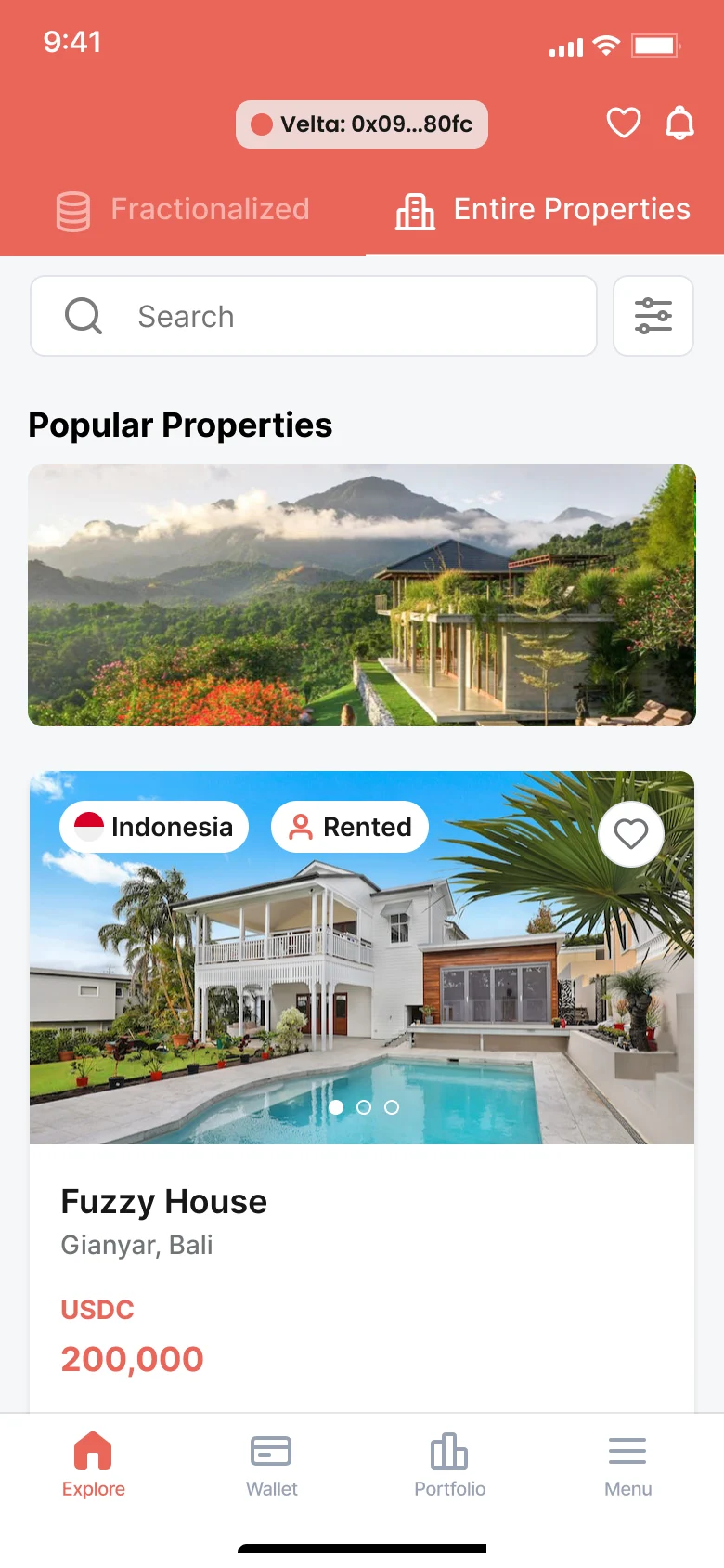
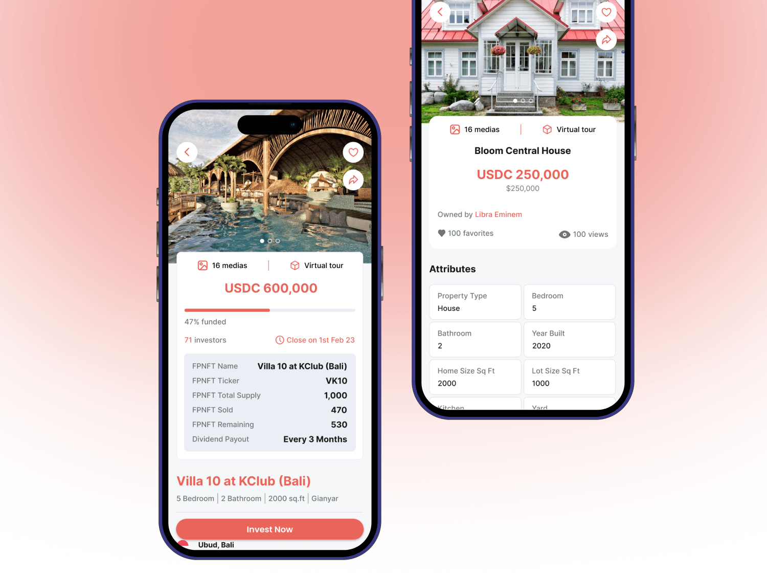
Investing here is a crypto transaction people cannot undo, so every step had to show what happens next before it happens. Browsing works without a wallet. The wallet is only asked for at the moment of investing, and checkout unlocks one button at a time: agree, approve the token, then buy. The prototype below runs the screens from the Figma file.


1/7 · Explore. Switch to Entire Properties and watch the header change.
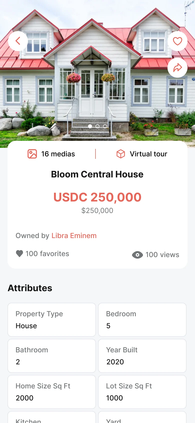
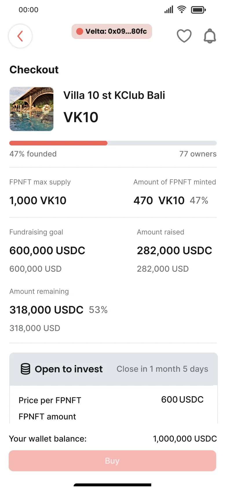
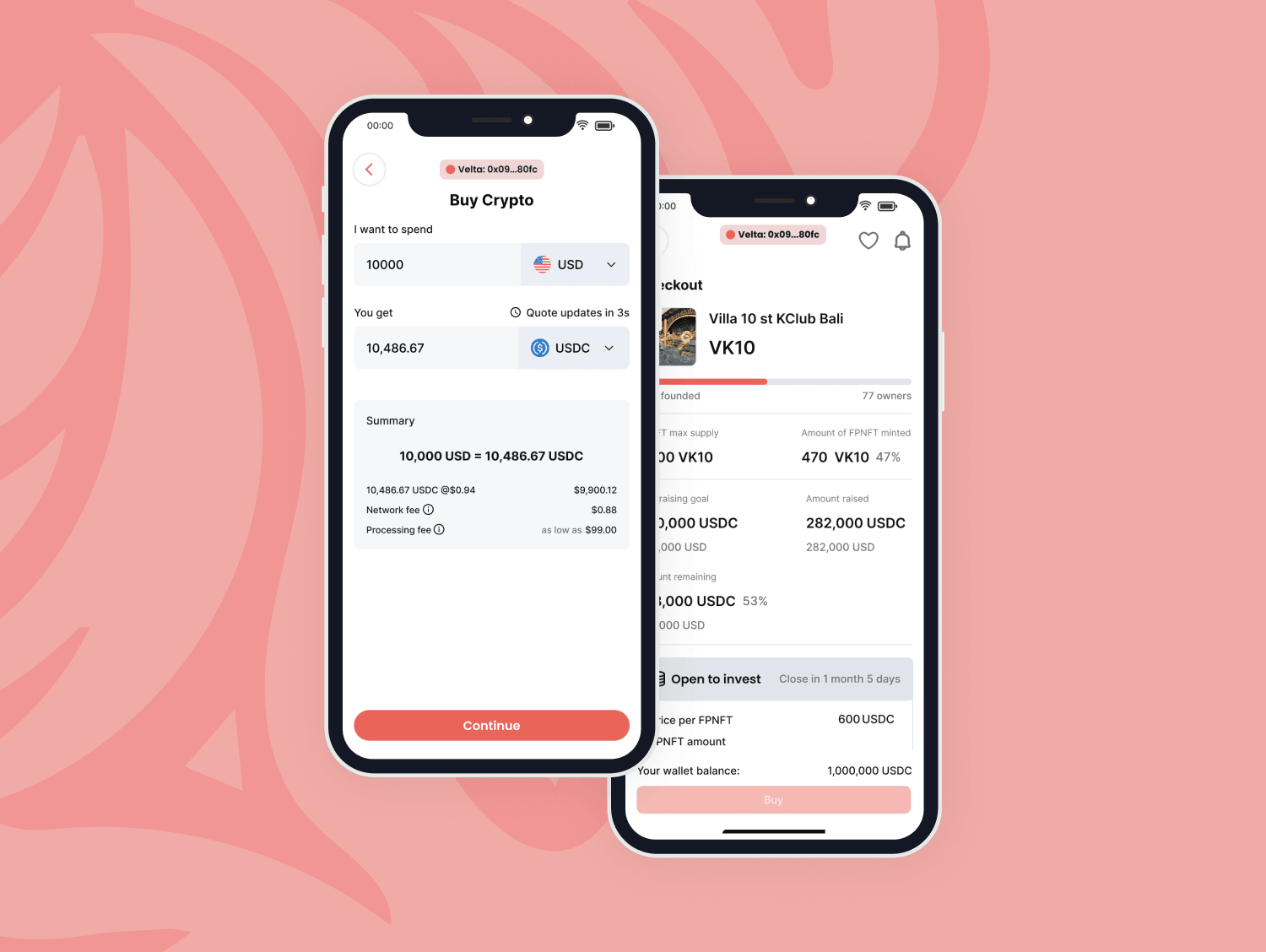
Checkout that feels like shopping
- Buying property tokens works like a normal e-commerce purchase
- Fiat to USDC conversion with a live quote that refreshes every 3 seconds
- Conversion rate, network fee, and processing fee all shown up front
Investment calculator
- Sliders for investment amount and property value growth
- Projected returns, monthly rental income, and ROI, so a token reads like a real investment
Guided KYC
- 3 steps: employment, identity document with camera capture, and address
- Clear progress indicators to reduce drop-off in a compliance-heavy flow
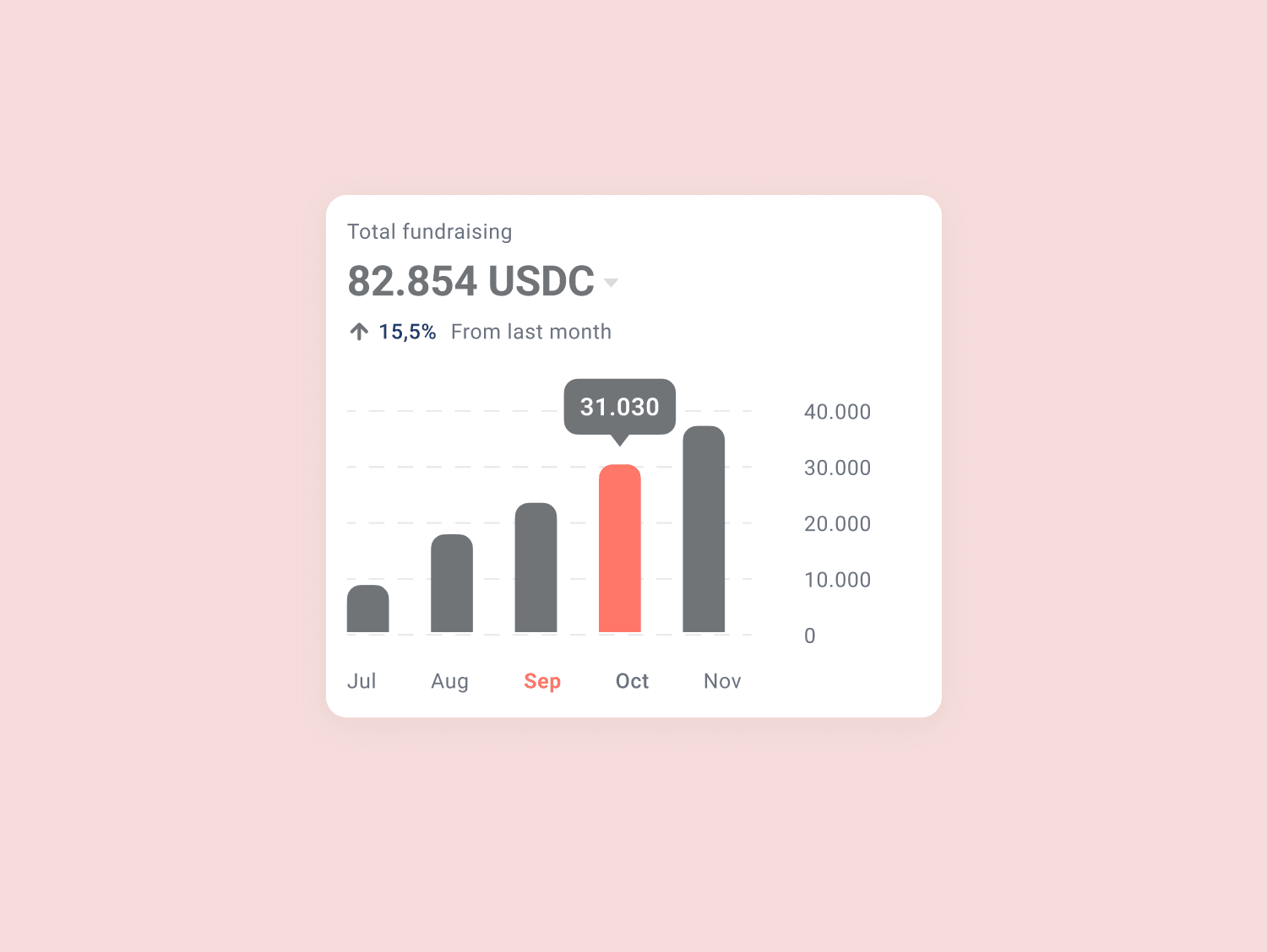
Developer listing wizard
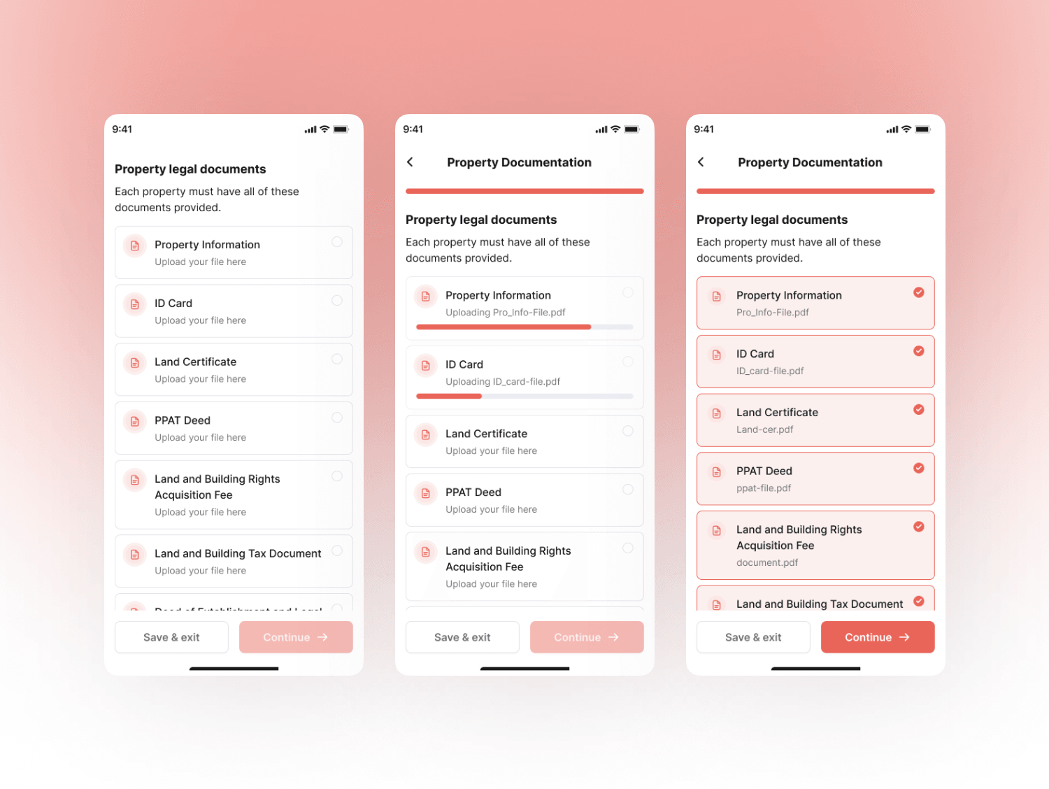
- Step by step flow to add property details, photos, and documents
- Set token count, price per token, and investment terms, with validation at each step
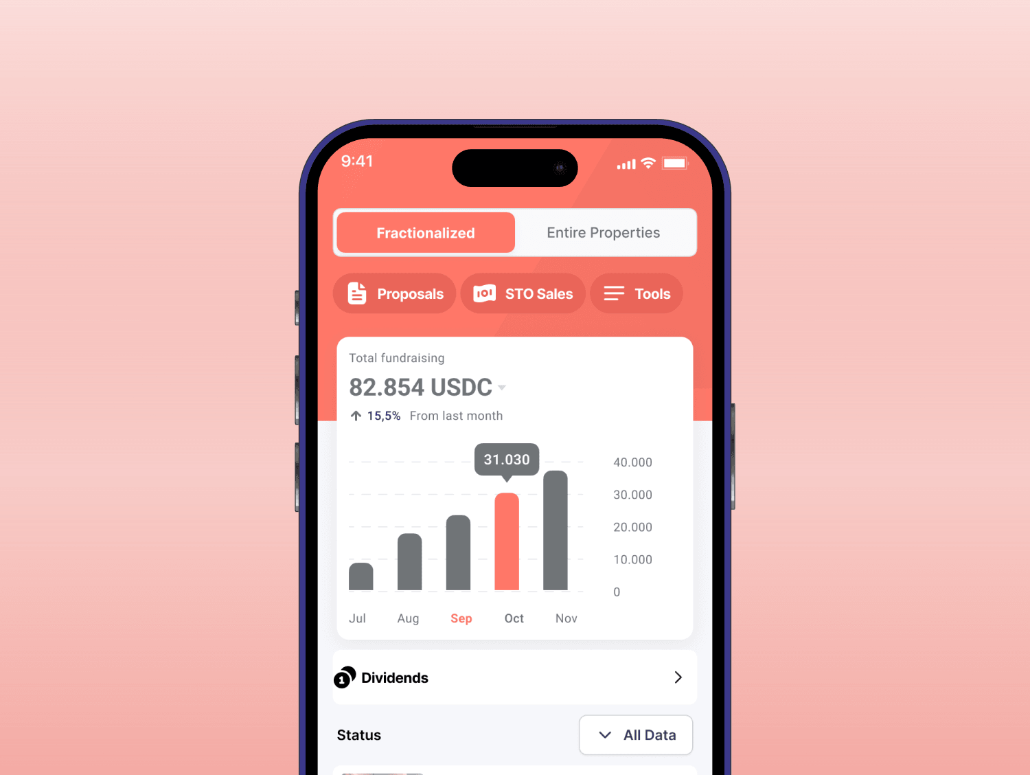
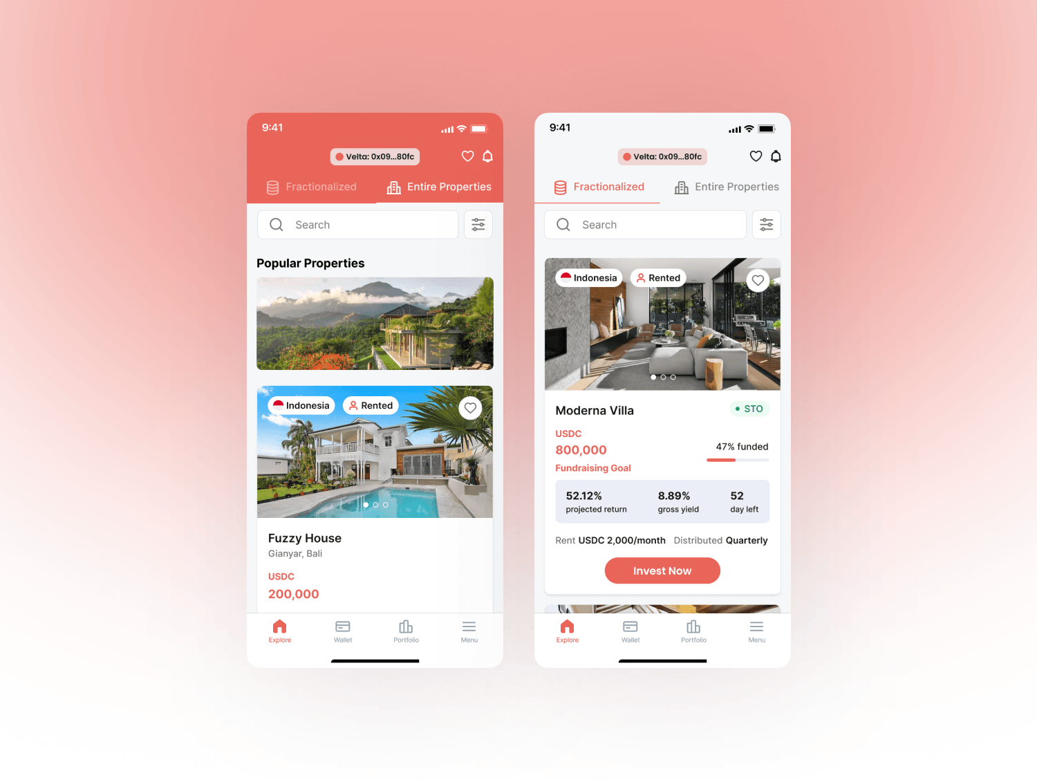
Design system
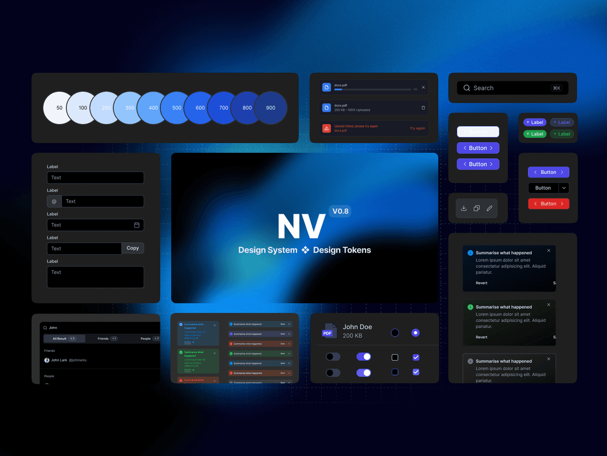
UI took the biggest share of time, 80+ hours. I built the visual system first, then property cards, calculators, and wallet components on top of it, with responsive layouts and state variations. Because both portals pull from the same components, the investor dashboard and the developer dashboard stay consistent even though they answer very different questions.
Results
I delivered a complete dual-sided marketplace from scratch, with KYC and investment flows built for regulatory compliance and one consistent experience across both portals.
- 160+
- Design hours across four phases
- 30+
- Hi fi screens across both portals
- 18+
- Unique pages
- 2 months
- From research to handoff
Learnings
Crypto UX is an empathy problem. The hard part was not technical. It was understanding how anxious people feel about transactions they cannot undo, and designing trust into every step. I also learned that a two-sided marketplace needs shared DNA: different goals on each side, one design language underneath.
More projects
Contact
Have a project? Say hello at