
Appendix
One platform for everything a clinic runs in a day.
Appendix is a clinic management platform that puts queues, consultations, and billing in one place. I designed it solo in one month for the people who keep a small clinic moving: receptionists, doctors, cashiers, and admins.
Problem
Clinic work was split across separate tools and paper.
- Fragmented systems: staff switched between separate tools for scheduling, records, and billing.
- Manual processes: paper check-ins caused long queues and data entry errors.
- No queue visibility: doctors kept asking "who's next?", which broke their focus.
- Scattered payments: tracking payments across several systems meant some payments were missed.
Goal
Cut patient check-in time by 50%, give doctors real-time queue visibility, speed up checkout, and run the whole clinic from one platform.
My role
I was the only designer. I ran the research, mapped the workflows and information architecture, and took the product from flows to hi fi UI, prototype, and design system in Figma.
Research
- Contextual inquiry at 3 clinics showed check-in was the biggest bottleneck.
- Interviews with 5 doctors and 4 receptionists made it clear queue visibility mattered most to doctors.
- Workflow mapping of 2 clinic operations showed missed appointments were costing real revenue.
- A review of 5 clinic tools found most of them overcomplicate simple workflows.
The takeaway: doctors needed to see their queue without leaving the desk, reception needed speed, and no one was tracking no-shows.
Approach
I kept the structure small: Home, Queue Management, Doctors, Checkout, and Settings. Then I designed around three core flows, each in as few steps as I could get away with.
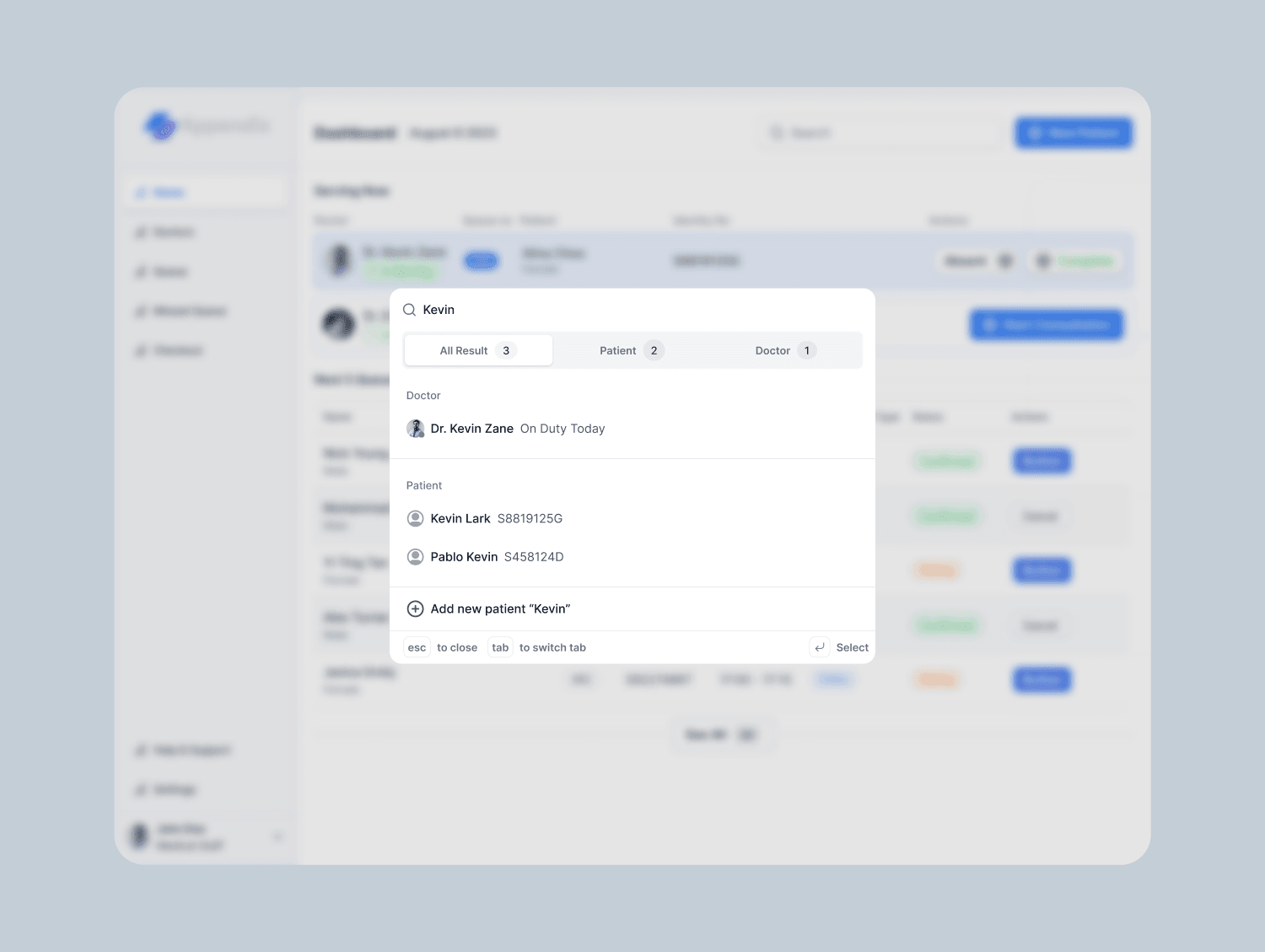
- Check-in: search or create the patient, pick a doctor, add to queue.
- Consultation: view queue, call the patient, start, complete, send to checkout.
- Checkout: add items and medicines, take payment, print the receipt.
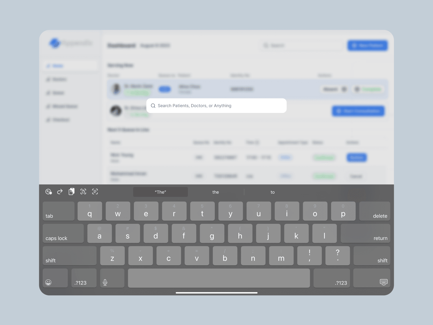
For the tablet version of Home, all four sections (Doctors, Upcoming Queues, Missed Queues, Checkout) had to fit on one 12.9 inch screen without scrolling. I tried a quadrant layout and a stacked priority layout, then chose an asymmetric one: primary work on the left, exceptions and payment on the right, with checkout details collapsed until tapped.
Try it
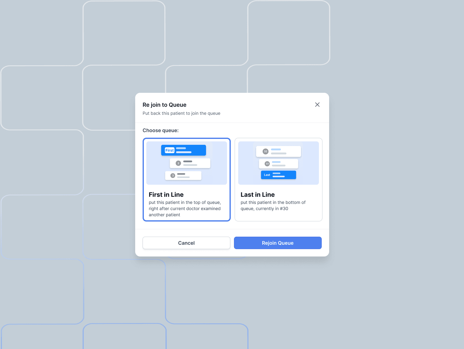
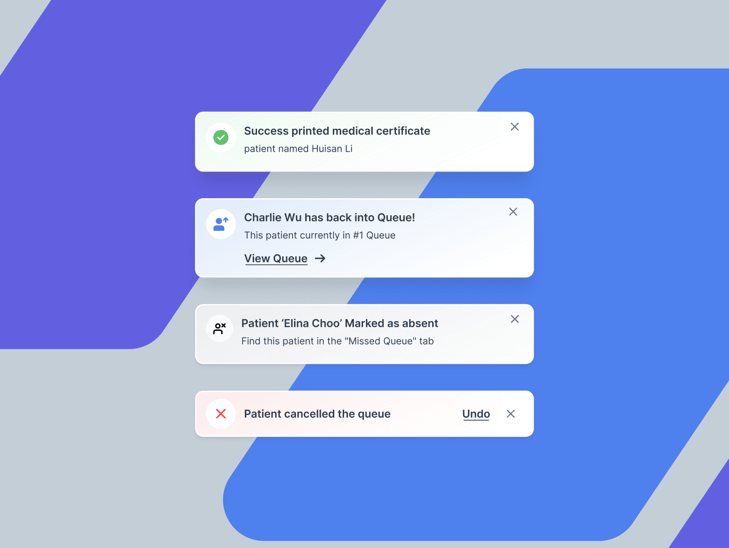
Reception, doctors, and cashiers each live in one screen, so every action had to confirm itself without a page change. I authored the motion in Figma first (button press, rows closing the gap, toast arrival, dialogs) and the prototype below is the same artboard, running on those timings and springs.






Home dashboard
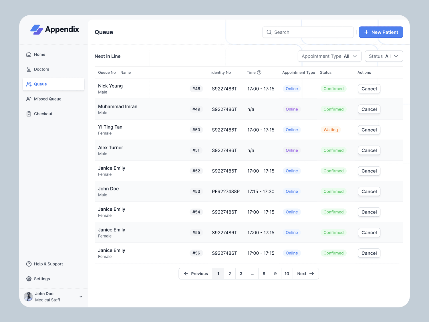
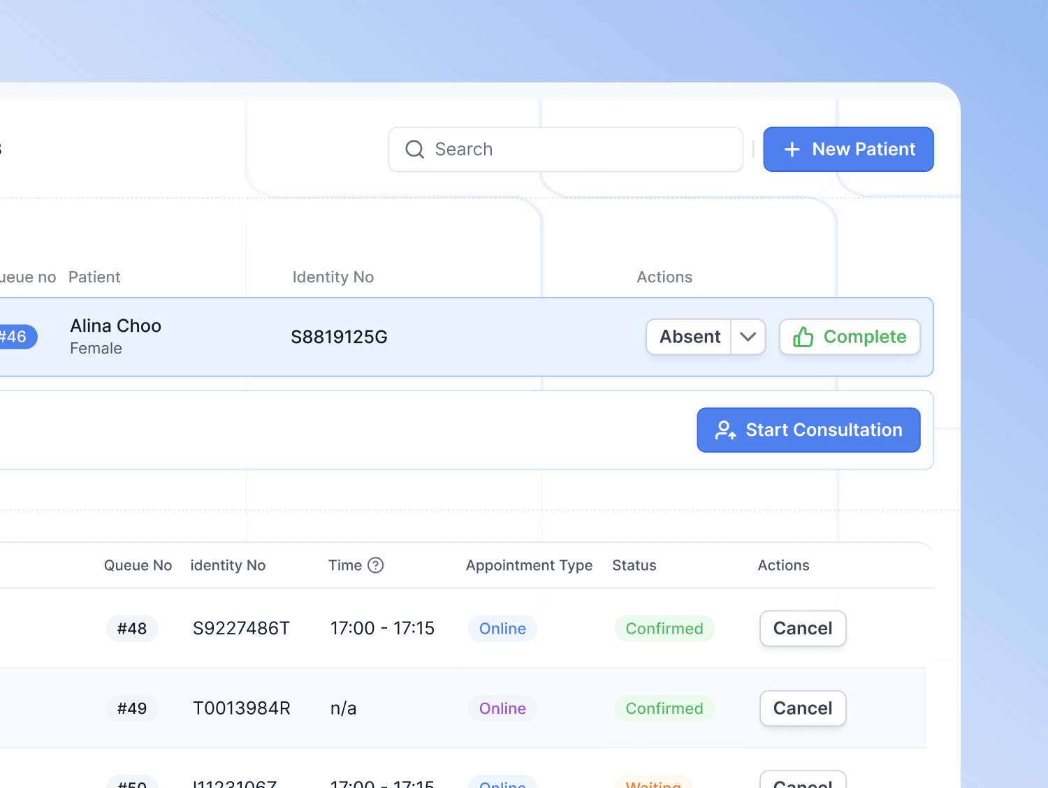
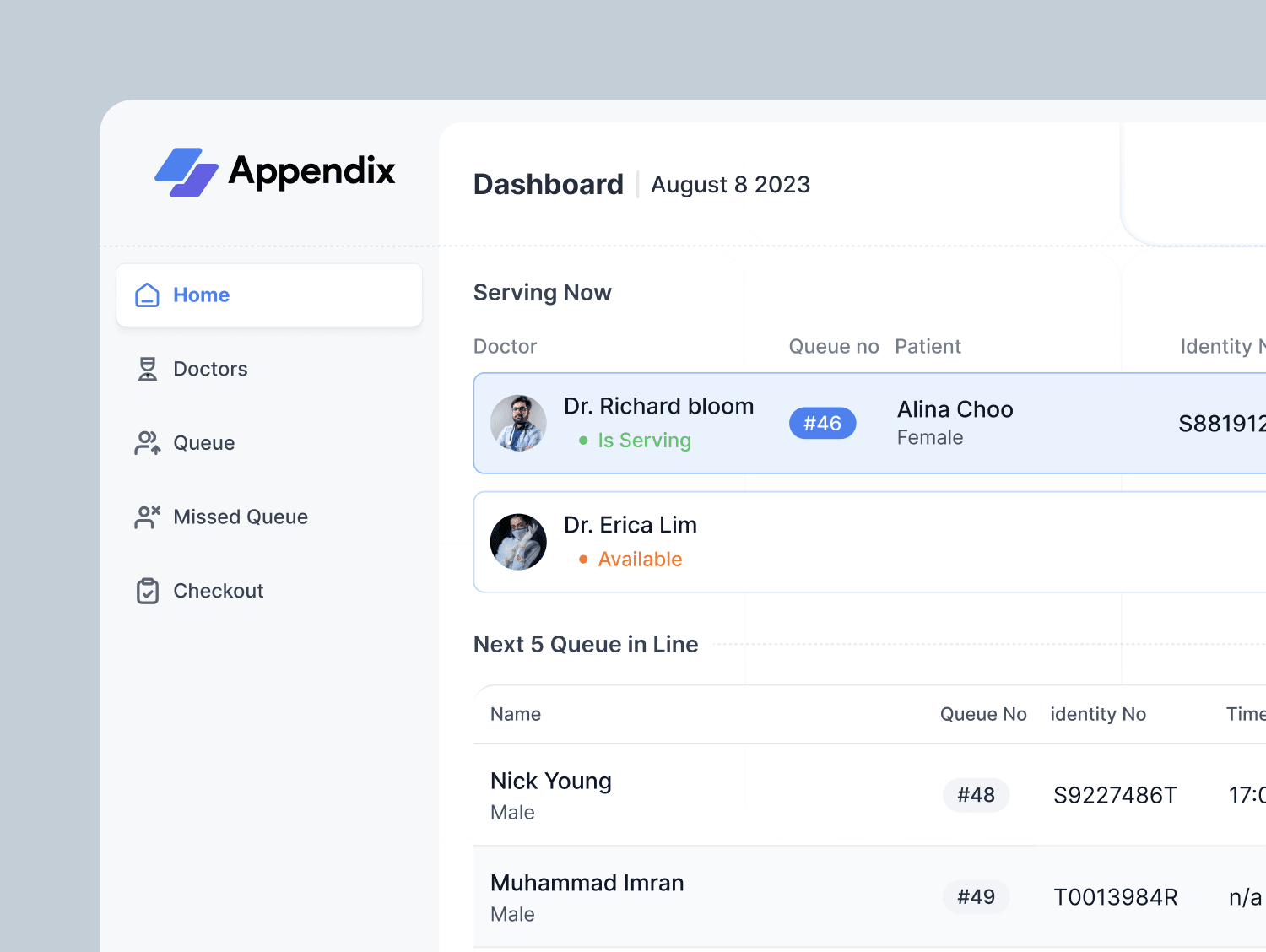
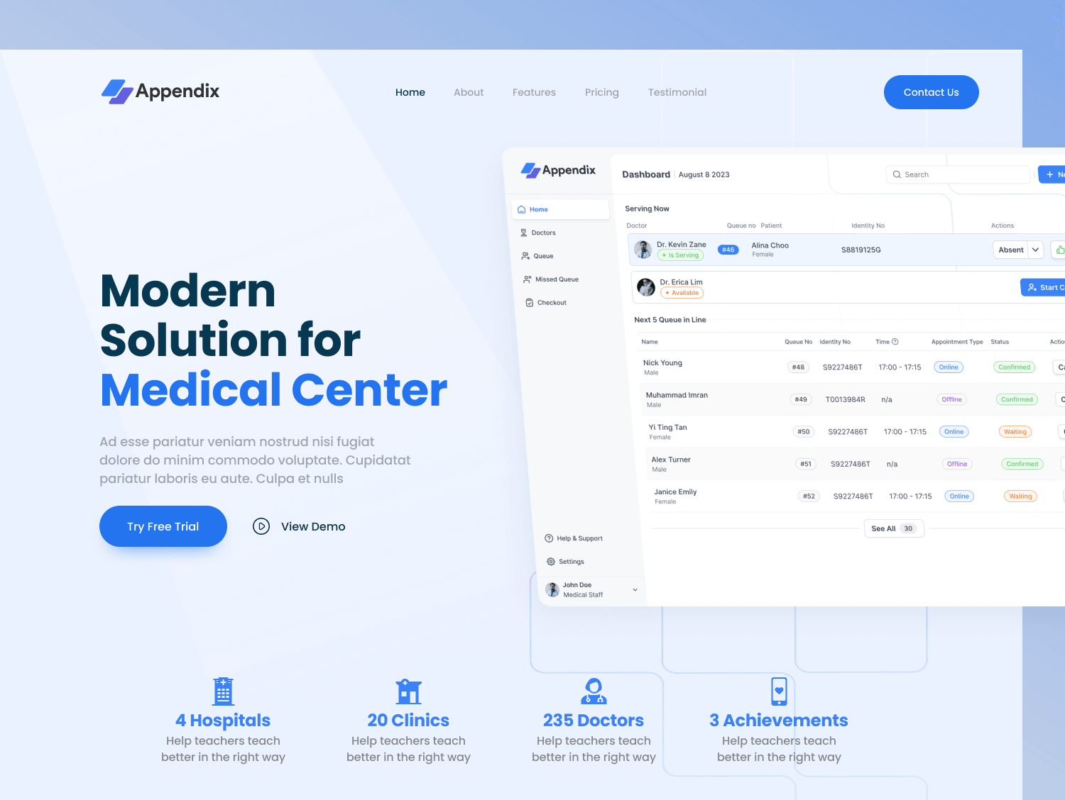
- Doctors on duty with specialty and queue count, next to today's queue with status and wait time
- A quick add button to get walk-ins into the queue fast
Queue management
- Patients sorted by wait time with status badges, filterable by doctor or status
- Start, Mark Absent, and Cancel, with confirmations on anything destructive
Missed queue
- Patients who did not respond when called, with contact info
- One tap to move them back into the active queue, plus history to spot repeat no-shows
Checkout
- Invoice editor for consultation fees, medicines, and procedures
- Cash, card, or insurance, then print or email the receipt
Design system
The system was built for scanning under pressure. Data tables carry most of the product. Status badges use one color per state: yellow for waiting, blue for in progress, green for completed, red for missed. Buttons come in primary, secondary, and destructive variants, and the sidebar shows navigation based on each person's role. On tablet, action buttons are 44x44 px and table rows are 56px tall so they work with a finger at a busy desk.
Results
Phase 1 covered the dashboard, queue management, missed queue, checkout, and role-based navigation. Patient registration, doctor scheduling, medicine and disease databases, prescriptions, reports, and inventory are on the Phase 2 roadmap.
- Expected check-in time drops from 5-7 min to 1-2 min.
- Queue visibility moves from asking around to a real-time dashboard.
- Payments move from multiple systems to one platform.
- 1 month
- Solo, from research to design system
- 20+
- Screens designed
- 5
- Complete user flows
- 3
- Clinics visited for contextual inquiry
Learnings
Clinic staff have no time to hunt for things, so the UI has to be scannable at a glance, with system state always visible: who is waiting, for how long, and what is next. I also learned to prevent errors instead of just handling them. A confirmation before cancelling a patient saves a lot more than it costs. If I had more time, I would test the tablet layout with real clinic staff and run an accessibility audit.
More projects
Contact
Have a project? Say hello at