
NV Design System
One token layer and component library shared by several products.
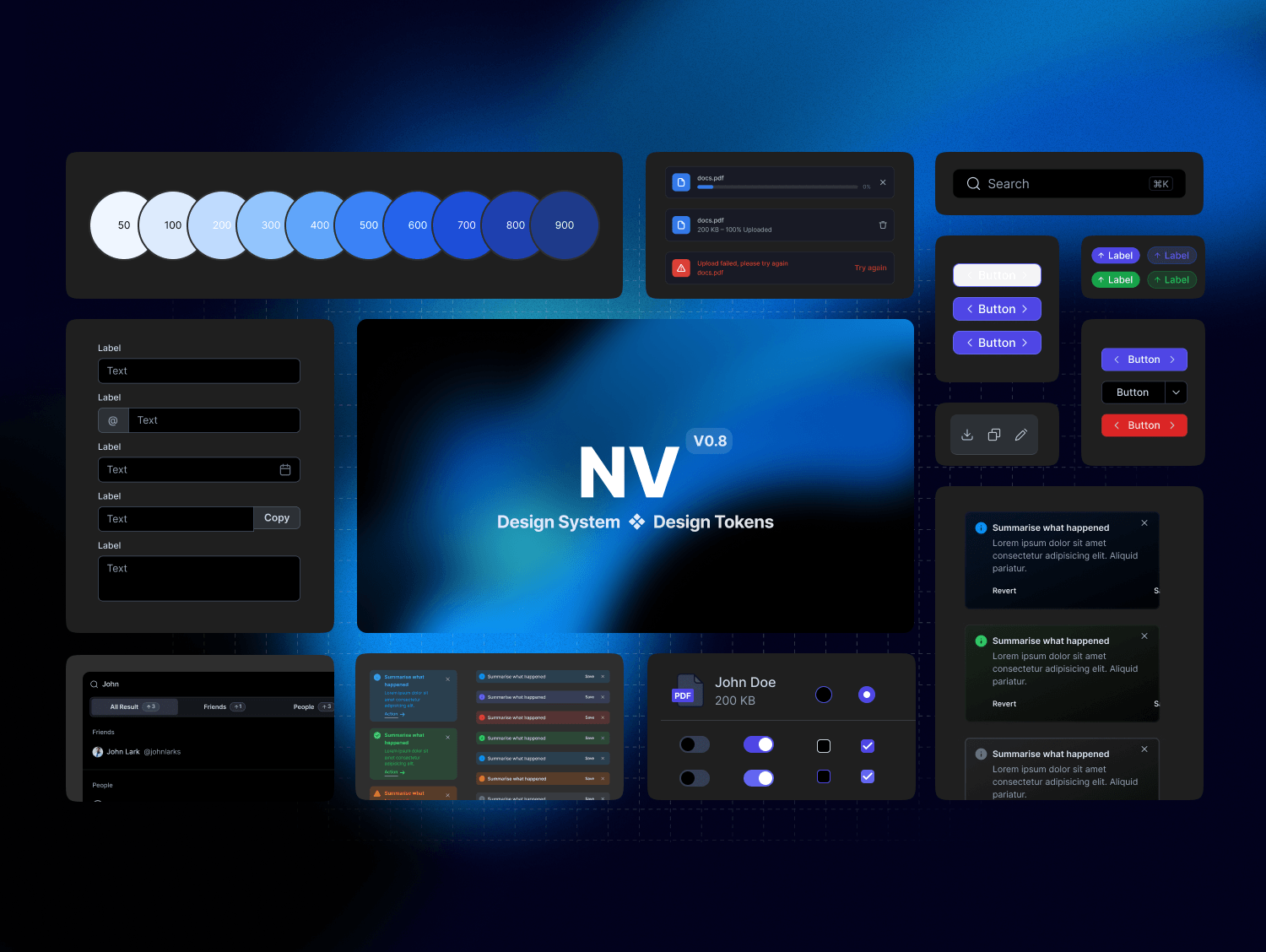
NV Design System is the token layer, component library, and documentation behind a set of products. I led it to give designers and developers one source of truth, so teams could ship faster without their UIs drifting apart.
Problem
- Inconsistent UI across products.
- Slow handoff from design to development.
- Duplicated effort across teams building the same pieces.
- Hard to scale design as the products grew.
Goal
Create a single source of truth for design, reduce inconsistencies, speed up both design and development, and make room for the products to grow.
My role
I was the design system lead, and also worked as UX and UI designer on it. I owned the token architecture, the component library in Figma, and the documentation.
Approach
I set up the system in layers, from raw values up to full screens. Tokens are split into colors, typography, spacing, shadows, and borders. The Figma library follows the same order: cover, foundations, components, patterns, templates, and documentation. That way anyone opening the file knows where to look, and a change at the bottom flows up to everything built on it.
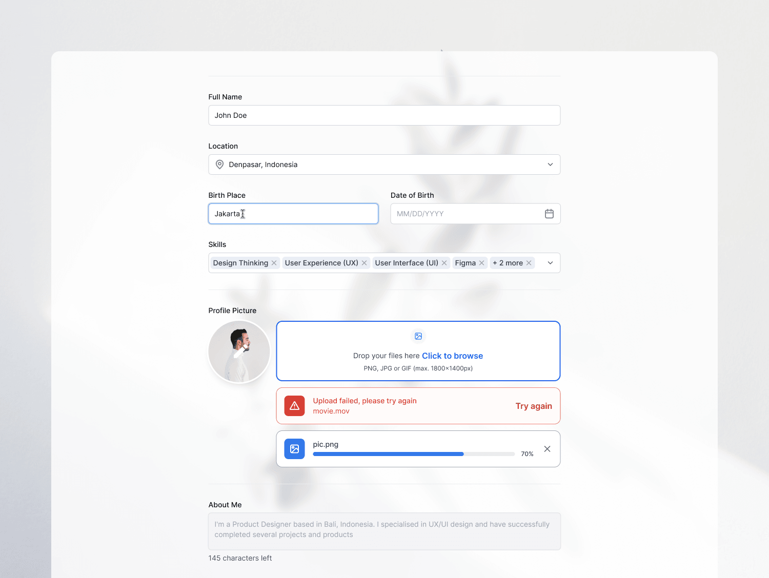
Component library
- 5 categories: inputs, navigation, data display, feedback, and layout
- Covers the everyday pieces: buttons, text fields, selects, tabs, tables, cards, alerts, toasts, modals, and more
Complete component anatomy
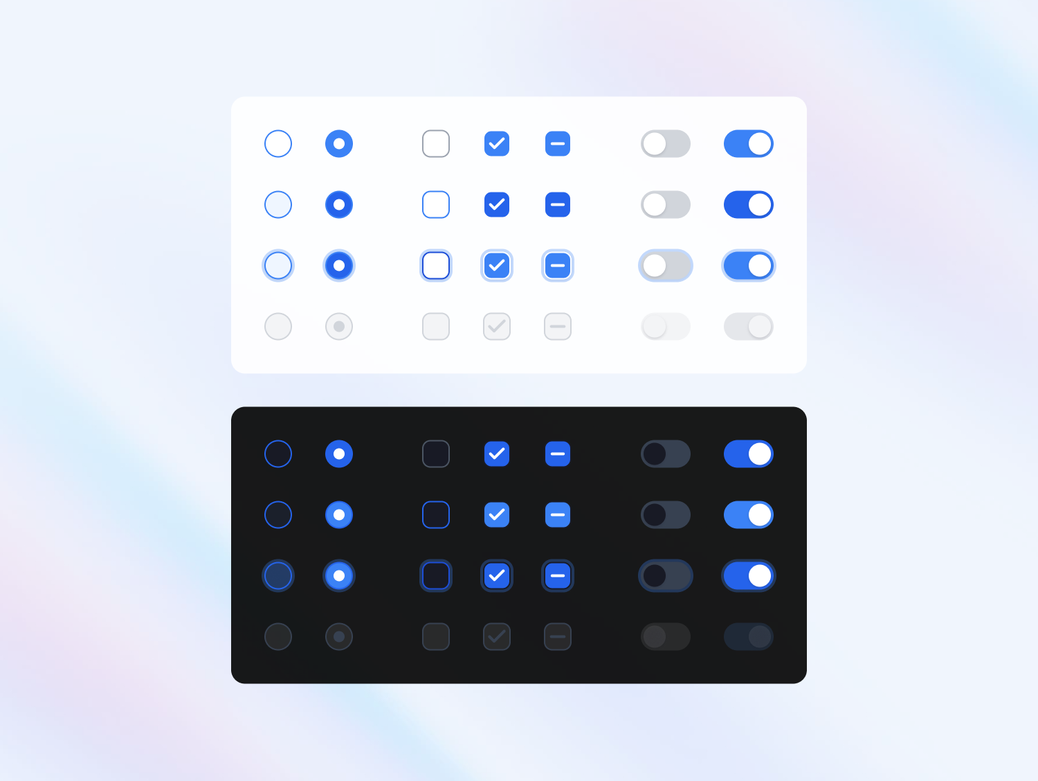
- Every component defined by states, variants, and sizes
- The button alone has 5 states, 4 variants, and 3 sizes
Documentation built in
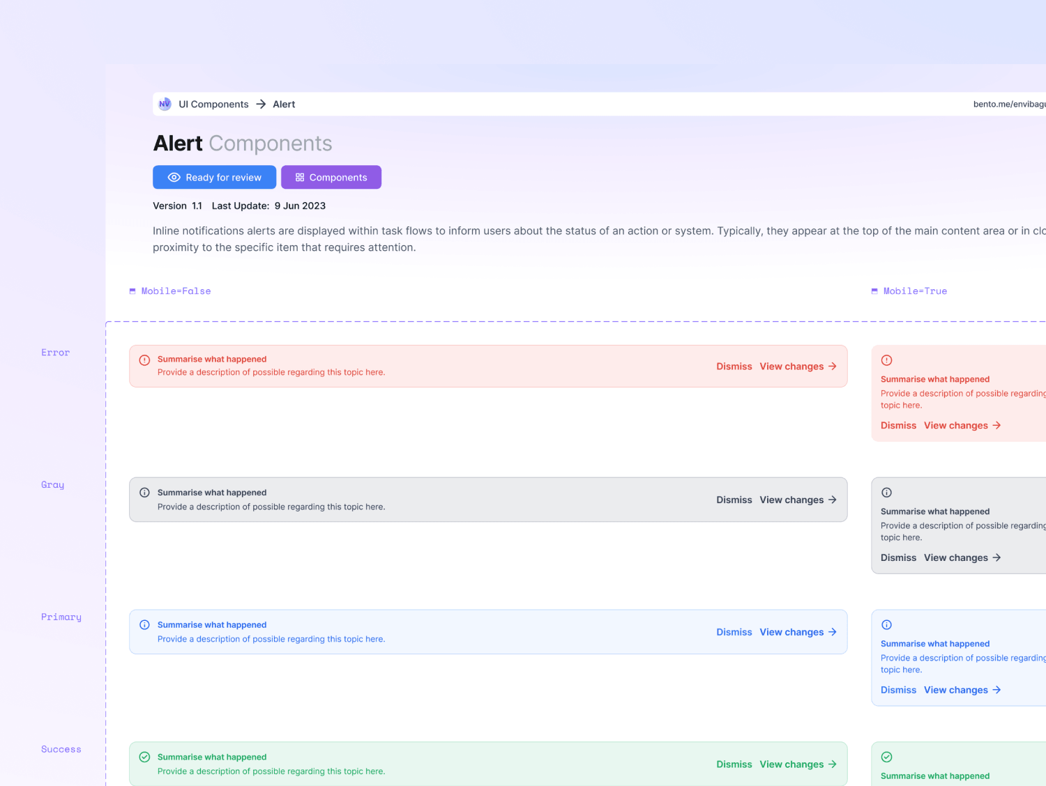
- Each component ships with visual examples, usage guidelines, and do's and don'ts
- Accessibility notes and code snippets for developers
Reusable patterns
- Forms, navigation, empty states, error handling, and loading states
- Solved once, reused across products
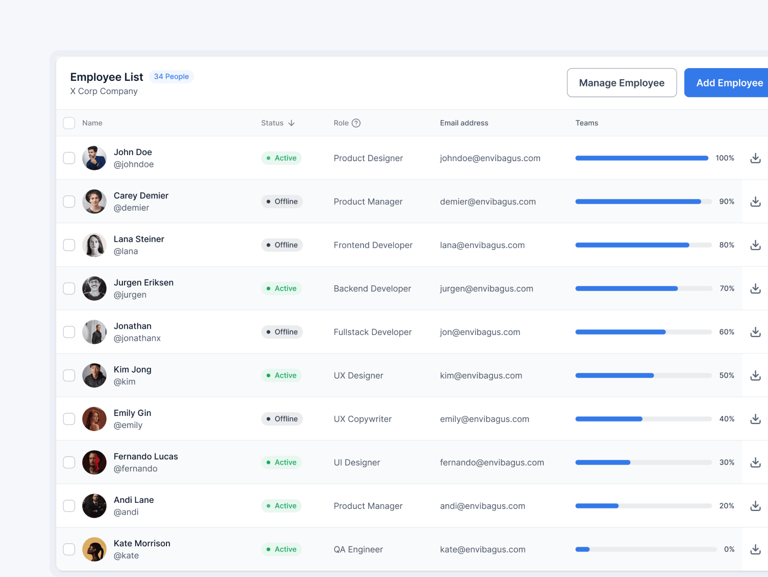
Design system
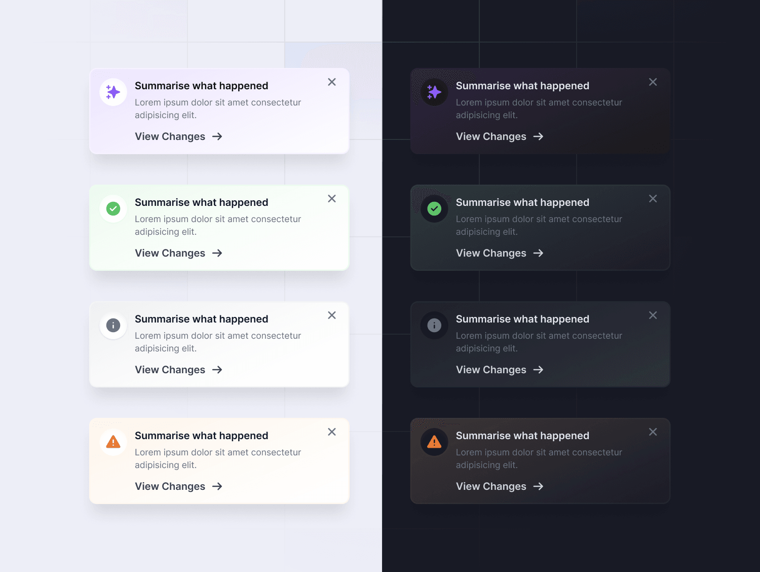
The foundations cover a color system with primary, secondary, semantic (success, error, warning), and neutral palettes, a type scale with set line heights and weights, a spacing scale built on a base unit, and grids for mobile, tablet, and desktop. The components, including light and dark versions of alerts and toasts, sit on top of those tokens.
More projects
Contact
Have a project? Say hello at