
PlaybookGPT
Know who does what before the disaster, and run it from one screen when it hits.
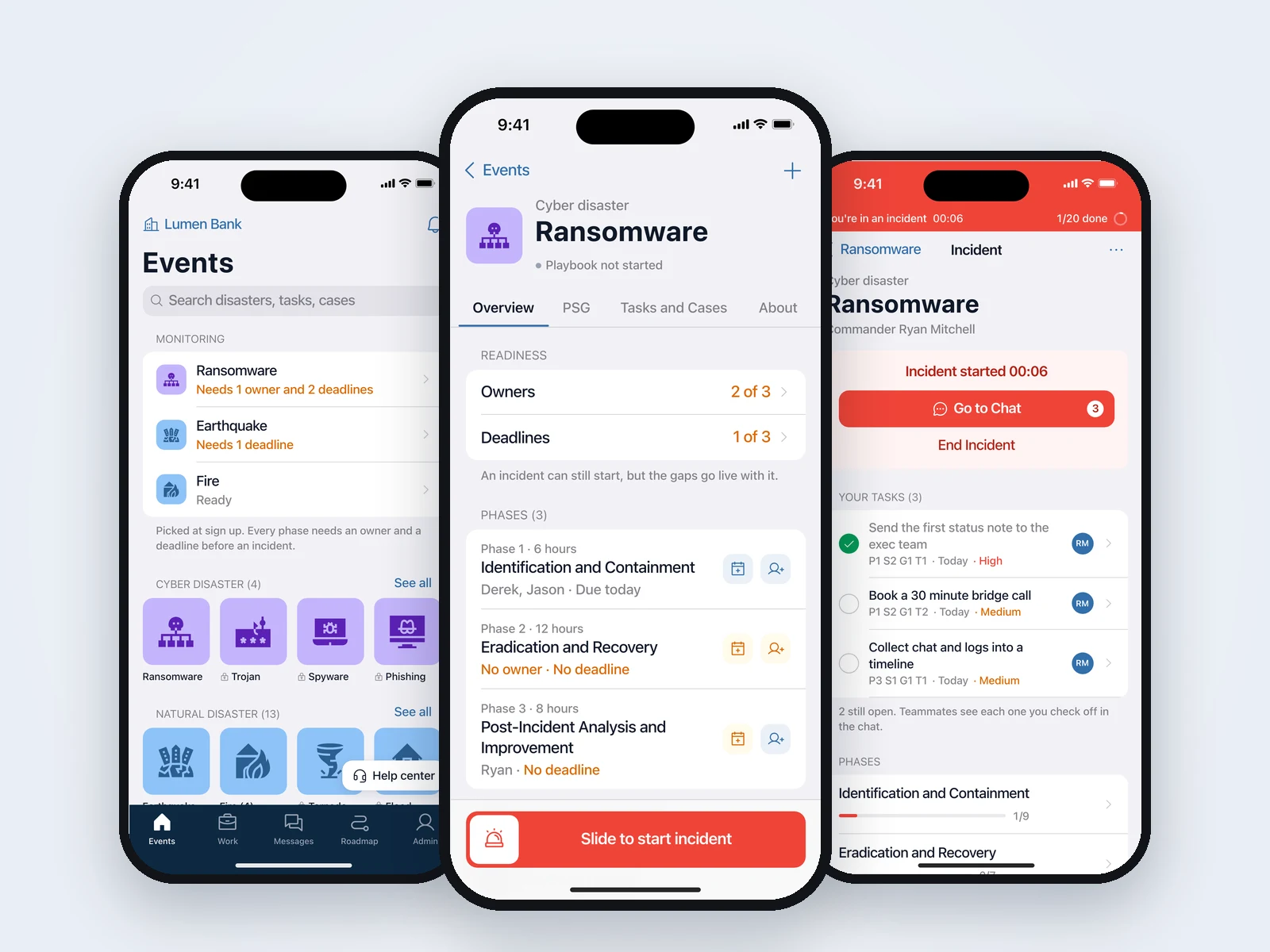
PlaybookGPT helps a company get ready for the bad day before it comes. Playbook AI drafts a response playbook for every threat the business picked, from ransomware to earthquakes. Managers give each part an owner and a deadline, and when an incident starts, the whole team works it from one screen and one chat. I designed the mobile app, from sign up to incident mode and the admin tools.
Problem
Most companies keep their continuity plans in a binder or a shared drive. They get written for an audit and opened again when something is already on fire.
- Nobody knows their part. A plan says "contain the infection", but not who does it or by when.
- Plans go stale. Teams change, people leave, and the plan still names them.
- Chaos on the day. Updates end up spread across calls, group chats and email, and nobody can say how far along the response is.
Goal
Turn the plan into something people work, not something they file. Before an incident, every piece has an owner and a deadline. During one, everyone sees the same clock, the same progress and the same list of what is theirs.
My role
UX and UI design for the mobile app. I mapped the flows, wireframed them and designed the screens in Figma: onboarding for companies and personal users, the disaster library, playbooks, incident mode, team chat with Playbook AI, the roadmap views, impact assessment, file manager, and the admin side for roles, teams and subscriptions.
How a playbook is built
Every playbook follows the same shape, so people learn it once:
- Phases. The big stages of a response, like Identification and Containment, then Eradication and Recovery, then Post-Incident Analysis.
- Steps. What has to happen inside a phase, in plain words.
- Goals. The outcomes a step needs, each with one owner.
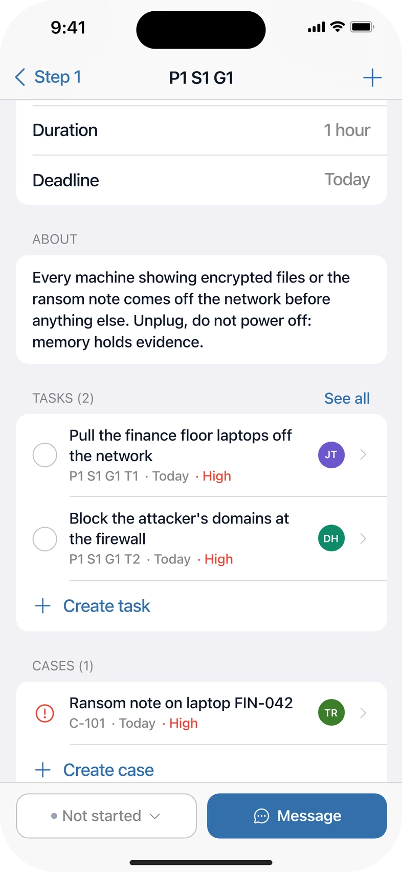
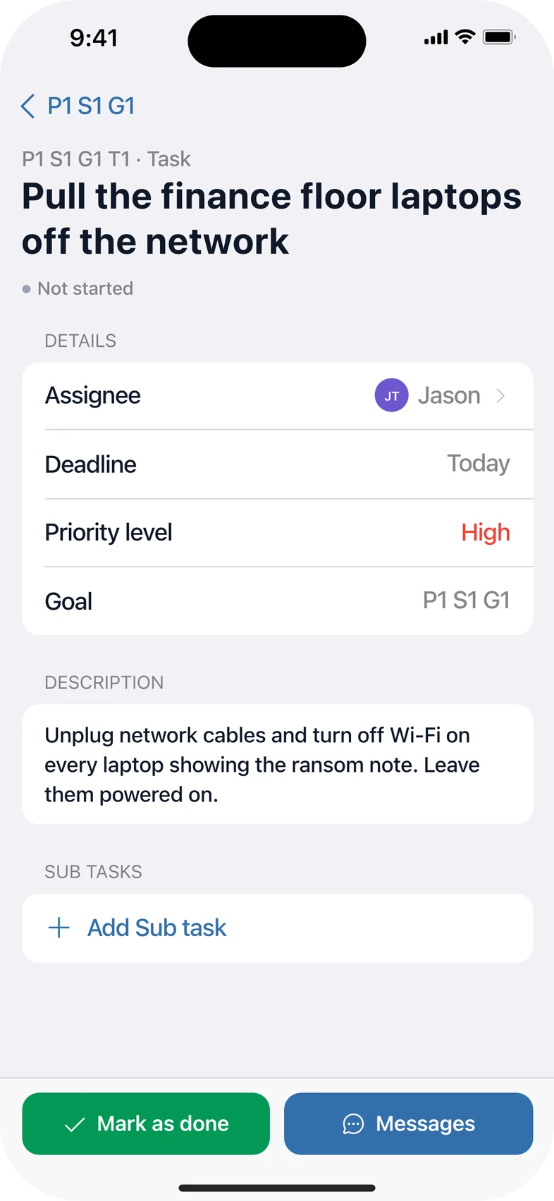
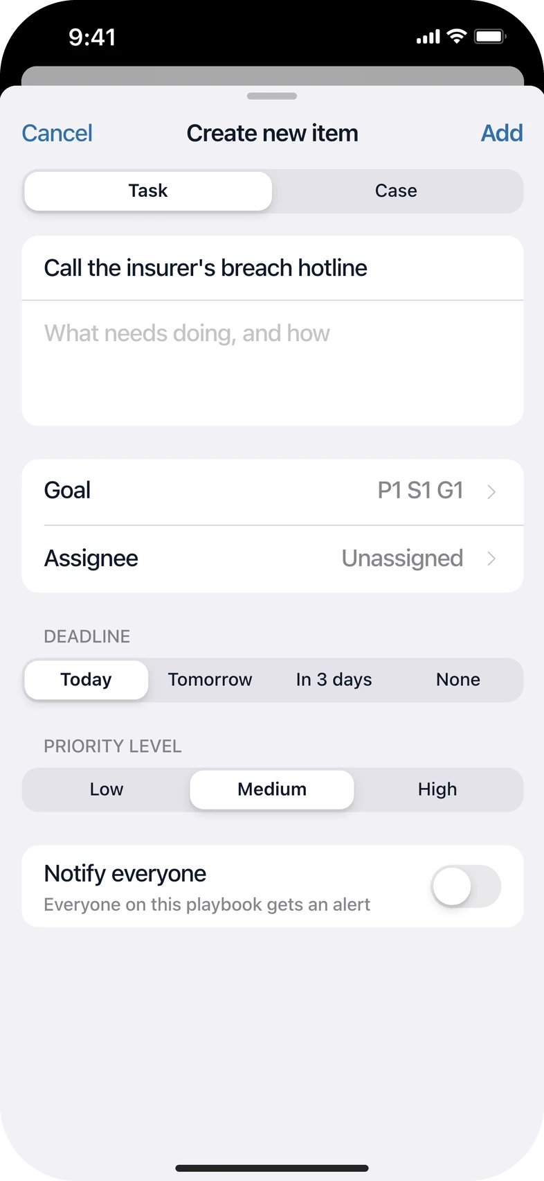
- Tasks and cases. The work itself. Tasks are things to do, coded like P1 S1 G1 T2 so they can be named in a busy chat. Cases are things that happened and need tracking, like a ransom note on a finance laptop.
Every level opens to the same page: owners, duration, deadline, its tasks and cases, and the level below. Playbook AI drafts the plan from the company profile and the threats picked at sign up. Anyone can add a task or a case on the spot.
- 4
- Levels in every playbook: phases, steps, goals, then tasks and cases
- 19
- Disaster types to pick from at sign up, across natural, cyber and human caused
- 300+
- Mobile screens in the final Figma file
Try it
The prototype runs the core loop. Ransomware starts out half ready: Phase 2 has no owner and two phases have no deadline. Give each phase an owner and a deadline until it reads 100%, then slide to start an incident. Pick real or drill, name the Incident Commander, and work the incident: open any phase, step or goal, check off your tasks, add a case, watch teammates finish theirs, and ask Playbook AI for a summary in the team chat.
1/10 · Home. Readiness first, then the full disaster library. Fire opens its site variants.
Starting an incident
Starting an incident pages a lot of people at once, so it has to be deliberate. In the first design it was a red button at the bottom of the playbook page, one tap away from a false alarm.
- Slide, then confirm. Sliding opens a confirm sheet instead of starting anything. It says how many people get paged and what goes live.
- A name on it. The sheet asks who the Incident Commander is, so every incident has one person in charge from the first minute.
- Real or drill. Teams can rehearse the same flow without waking up the whole company.
- No mistaking it. Once it starts, the whole screen goes red while the team is paged, then folds into the incident band that stays at the top of every screen.
Incident mode
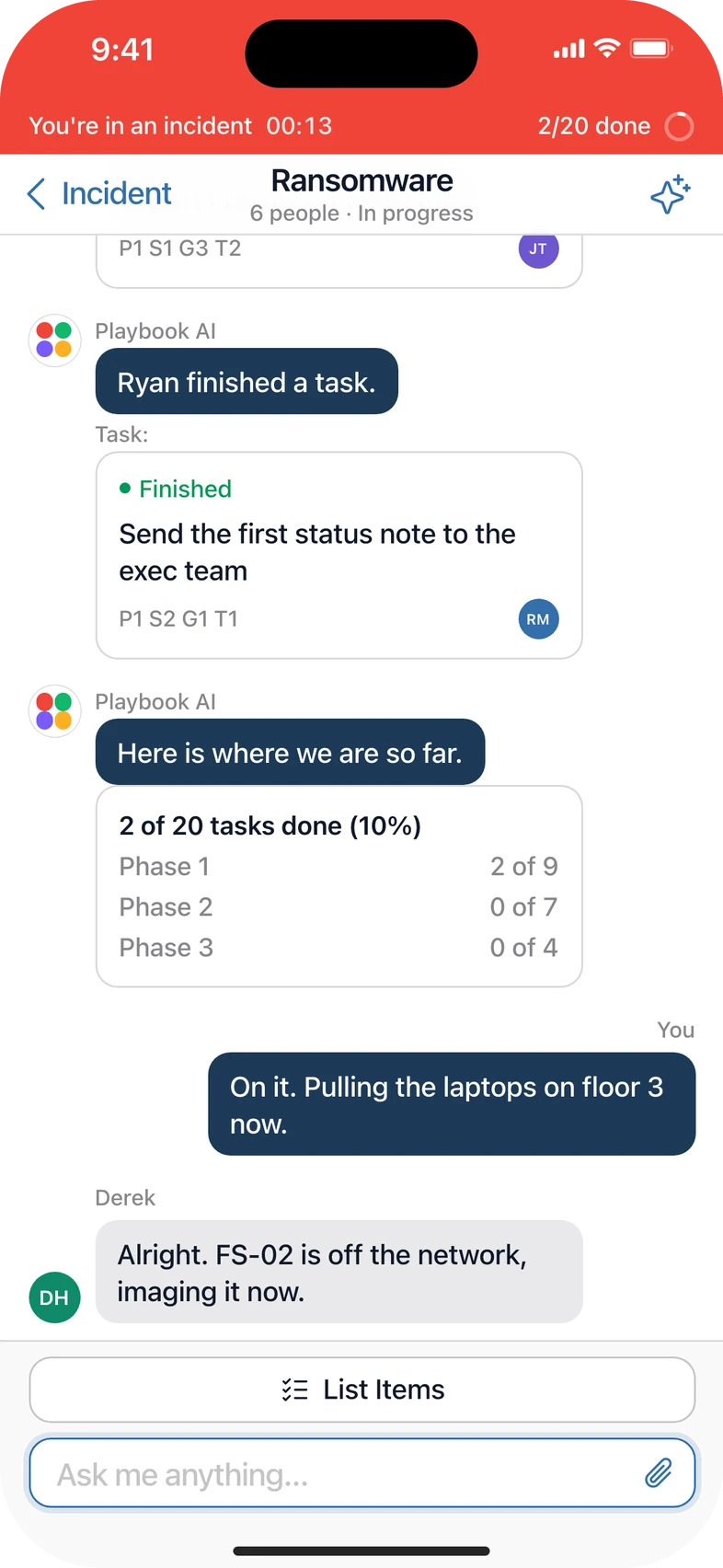
Once an incident starts, the app answers three questions on one screen: how long has this been going, how far along are we, and what is mine to do. The clock and the way into the team chat sit at the top, your own tasks come next, then each phase with its progress bar.
Anywhere else in the app, a red band under the status bar keeps the clock and the goal count in view, and one tap on it brings you back.
Playbook AI in the team chat
Every incident gets its own chat. Playbook AI posts the tasks for the current step as cards, says who finished what, opens the next step when one is done and posts a progress summary when asked. People still talk to each other in plain messages. The AI keeps score so nobody has to.
Readiness first
- Home opens on how ready the monitored playbooks are
- Each playbook shows owners and deadlines per phase, so the gaps are obvious before anything happens
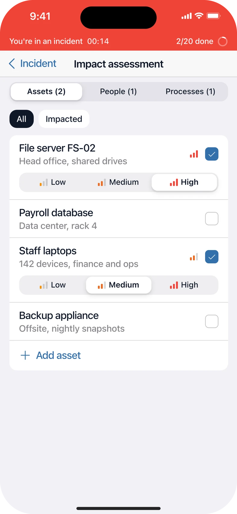
Impact assessment
- Tick the assets, people and processes an incident hit
- Low, medium or high for each, so recovery starts with what matters most
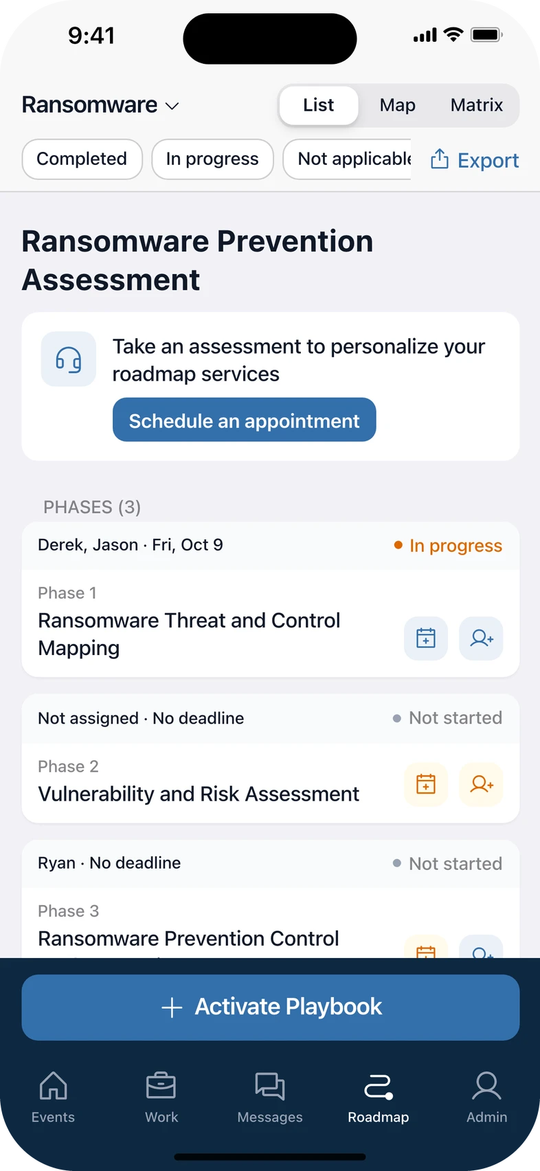
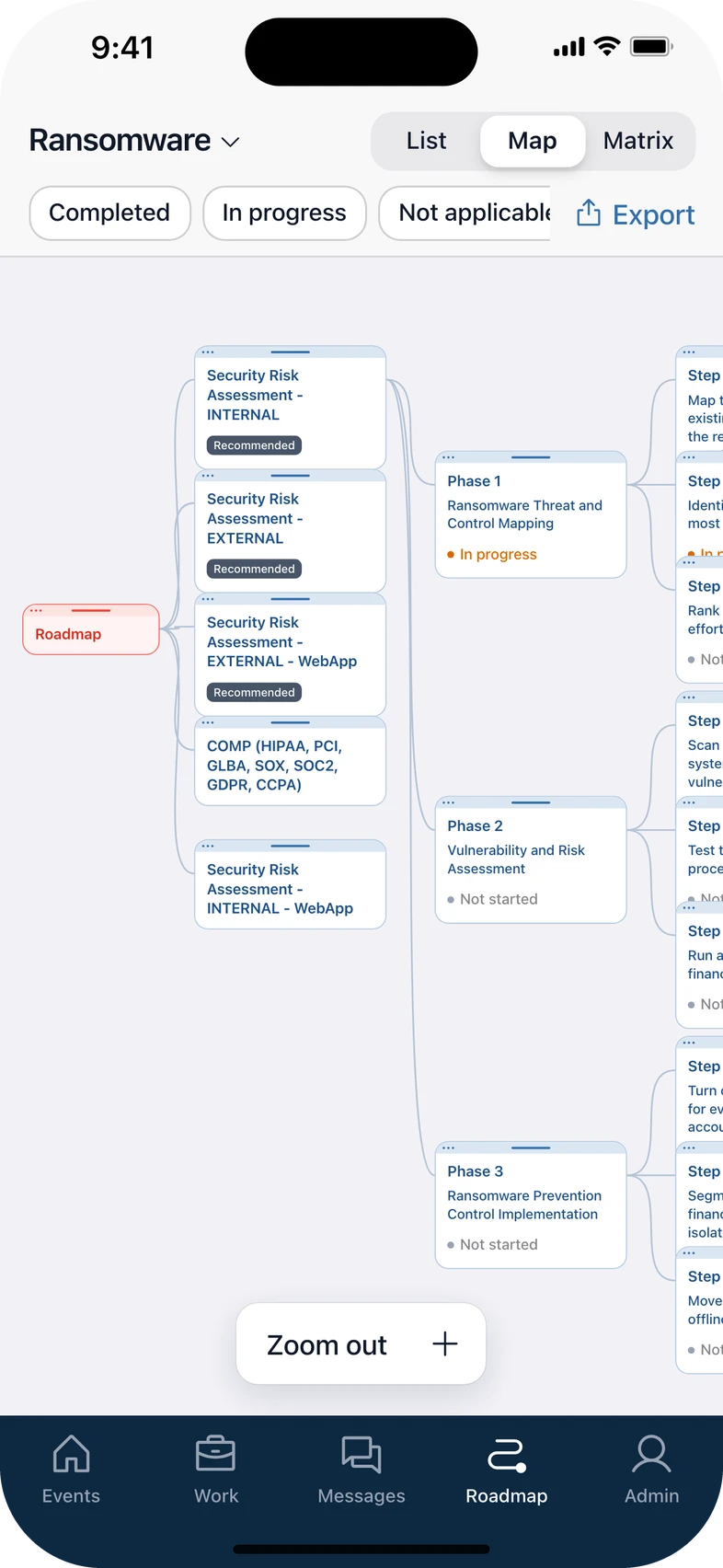
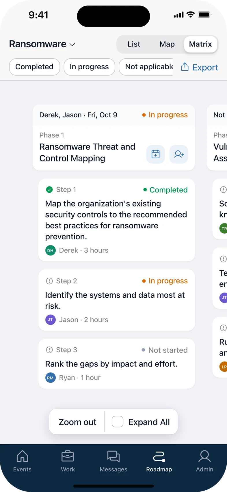
Three ways to see the plan
- The prevention roadmap as a list, a map from each assessment down to its steps, or a matrix of phases and steps
- Pinch or drag to zoom, filter by status, export a PDF or share it in the chat
Built for companies
- Join by invite link as an executive, department manager or team manager, each with their own onboarding
- Regions, departments and teams, custom roles, and plans per seat
Revisited
The prototype above is not a copy of the 2024 screens. I rebuilt the core flows for this portfolio and fixed what I would do differently now:
- Native first. Inset grouped lists, system type sizes and hairline separators, so it reads like an iPhone app instead of a web page squeezed onto a phone.
- The brand stays. The navy tab bar, the colored disaster tiles with their illustrations, the red incident band and the navy Playbook AI bubbles all come from the original file.
- Color only where it means something. Orange marks a missing owner or deadline, red means an incident is live. Everything else stays neutral.
Takeaways
- Design for the worst five minutes. Every screen in incident mode had to work for someone stressed, on a phone, with half their attention.
- Make the dangerous action slow and the routine one fast. Checking off a goal is one tap. Paging the company takes a slide and a confirm.
- Let the AI keep score. People coordinate better when nobody has to ask "where are we?" in the chat.
More listedProjects
Contact
Have a project? Say hello at